Your email list is your most valuable owned asset in digital marketing, more reliable than social followers and more cost-efficient than most acquisition channels. Yet many businesses lose potential subscribers within seconds of landing on a poorly designed signup form. A confusing layout, too many fields, or an unclear call to action sends visitors away before they enter their email address. The difference between a converting form and one that doesn’t often comes down to focused design and copy decisions. Email deliverability ultimately depends on standard authentication protocols (SPF, DKIM, DMARC) and sending-reputation systems managed by internet service providers, factors that no single platform controls entirely. A well-maintained, engaged list and compliant signup process support better inbox placement, but do not guarantee any specific open rate, click rate, or revenue outcome.
Why Email Signup Forms Matter for List Building
A high-performing email signup form is the daily engine that converts passing website traffic into owned audience members. Unlike social media followers, where algorithm changes can disappear your reach overnight, email subscribers are people who’ve explicitly given you direct access to their inbox. Yet most businesses underestimate how aggressively they need to grow their lists to counteract natural decay. This section explains why signup forms are the cornerstone of sustainable email marketing and how list decay affects your long-term strategy.
Email Lists as a Strategic Business Asset
Your email subscribers represent people who’ve already chosen to hear from you, making them fundamentally different from borrowed platforms. Email remains the most widely used communication channel globally, with 4.48 billion email users worldwide. The financial case is equally compelling: email marketing boasts an average return of $36 for every $1 spent, significantly exceeding social media acquisition, search traffic, and most paid advertising channels. A signup form that captures even a small percentage of your visitors compounds this advantage over time, but only if those forms actually work.
The fundamental challenge every marketer faces is simple yet persistent: every visitor who lands on your site and leaves without entering their email is a lost opportunity forever. Many businesses use less-optimized newsletter signup forms or hide subscription options behind buttons and links nobody clicks, letting potential subscribers slip through the net. The solution isn’t to add more forms or deploy aggressive popups; it’s to build forms that remove friction without sacrificing data quality or compliance with regulations like GDPR and CAN-SPAM.
Offsetting List Decay Through Continuous Growth
Email lists naturally decay by 20–30% annually through unsubscribes, address abandonment, and natural churn, meaning a brand that stops actively building loses a quarter of its audience every year. The average email list growth rate across all industries is approximately 2.5% per month, while healthy steady-state growth of 1–3% per month is considered acceptable for mature lists. What does this mean in practice? A list growing at 2% per month can barely offset the 25–30% annual decay; you’re running in place, not expanding. To actually grow your email marketing reach and impact, your signup forms need to drive growth above that baseline.
Niya Digital’s team has observed that businesses that focus on owned-audience growth through email consistently outpace competitors who rely primarily on social media or paid advertising, especially during algorithm shifts or economic downturns when external channels become unpredictable or costly. This isn’t just theory; it’s a pattern seen across industries and company sizes. The businesses that maintain healthy subscriber growth aren’t hoping for viral moments; they’re optimizing their signup forms, testing relentlessly, and building list growth into their core marketing operations.
Email Marketing Plans
Email Marketing Beginner
For anyone getting started with email marketing.
- Up to 500 Contacts
- Add more anytime
- Send up to 5,000 Emails/Month
- Single Signup Form
- Basic Image Storage
- Unsubscribe Handling
- Works with Facebook, Etsy & More

Email Marketing Up & Running
Already have clients? This plan’s for you.
- Up to 2,500 Contacts
- Add more anytime
- Send up to 25,000 Emails/Month
- Unlimited Signup Forms
- Unlimited Image Storage
- Unsubscribe Handling
- Works with Facebook, Etsy & More
- Automated Welcome Email
- Converts Blog Posts to Email
- Unsubscribe Options
- Hot Leads List
Email Marketing Pro
For savvy marketers with growing mailing lists.
- Up to 5,000 Contacts
- Add more anytime
- Send up to 50,000 Emails/Month
- Unlimited Signup Forms
- Unlimited Image Storage
- Unsubscribe Handling
- Works with Facebook, Etsy & More
- Automated Welcome Email
- Converts Blog Posts to Email
- Unsubscribe Options
- Hot Leads List
- Auto-sends Event Emails
- Automated Email Campaigns
- Record Signup IPs
- Share Statistics w/Others
Form Field Strategy: Balancing Growth and Data Quality
One of the most misunderstood optimization decisions in email marketing is how many fields to include on a signup form. There’s a clear and immediate tradeoff: fewer fields mean faster completion and higher conversion rates, but less data for segmentation and personalization. More fields capture richer data upfront but increase abandonment risk and friction. Understanding this tradeoff is the key to designing a form that works for your specific business model and audience.
How Field Count Directly Impacts Conversion Rate
Research from Formstack shows that forms with three fields can boost conversions by up to 160% compared to those with ten or more fields. The pattern is consistent and quantified across multiple studies: a HubSpot analysis found that reducing fields from 11 to 4 increased conversions by 50%. This isn’t a coincidence; each additional field is a decision point where visitors weigh the effort against the value they expect in return. The psychology is straightforward: the more barriers you create, the fewer people will cross them.
However, the popular advice to use as few fields as possible oversimplifies the picture. Context matters more than absolute rules: a visitor downloading a free checklist has a very different tolerance for friction than someone requesting a personalized product demo. For high-value offerings like enterprise software or complex SaaS solutions, additional fields can actually improve lead quality by filtering out casual browsers who aren’t serious enough to complete a longer form. The strategic principle is this: every field must earn its place by enabling an immediate action or filtering for qualification.
The Essential-vs-Nice-to-Have Field Audit
Start by auditing your current form honestly. For every field, ask yourself: “Do I absolutely need this data to send the next email, or can I collect it later once a relationship exists?” Many high-performing teams have discovered that collecting just three pieces of information- name, email, and company name- provides enough information to start a meaningful conversation and send personalized follow-up messages. Everything else- phone number, job title, company size, budget range, specific challenges- becomes a “nice-to-have” that can be gathered through follow-up emails, preference centers, or actual conversations after the subscriber has joined your list.
The psychological principle underlying this strategy is simple and powerful: lower barriers increase action. When prospects see a form that respects their time and doesn’t demand excessive information, they’re more likely to complete it and move forward. Email address is the only truly essential field for every signup form. First name helps personalize welcome emails and follow-up messages. A third field depends entirely on whether you can justify it with a specific business need: “We need work email to prevent personal addresses that bounce” works and serves a real purpose; “We want additional data for our reporting” does not. Collect what you need to take the next action, nothing more.
Form Field Decision Matrix
| Decision Factor | Why It Matters | Recommended Field Count |
|---|---|---|
| Offer Type | Free resources tolerate 2–3 fields; paid trials or product demos tolerate more friction | eBook: 2–3 fields; enterprise demo: 5–7 fields |
| Mobile Traffic % | Mobile users show 40% higher abandonment at field #4 and beyond | Cap essential fields if mobile >50%; never exceed 3 on mobile |
| Industry (B2C vs. B2B) | B2C eCommerce grows fastest with single opt-in + minimal fields; B2B prefers quality via double opt-in | B2C: 2–3 fields; B2B: 3–5 fields |
| Compliance Requirements | GDPR/CASL may require explicit consent language and double opt-in; always safer | Use double opt-in for regulated industries; always include privacy link |
| Budget/Resources | More fields = more data for segmentation but higher abandonment cost | Right-size to business need; collect post-signup data via email |
| Growth Target | Aggressive growth demands single opt-in + lead magnet; quality-focused = double opt-in + fewer fields | Set baseline (2.5% monthly) and choose strategy to exceed it |
| Data Collection Goal | Immediate action vs. deep segmentation; collect more data post-signup | Minimum viable fields at signup; segmentation email/form post-signup |
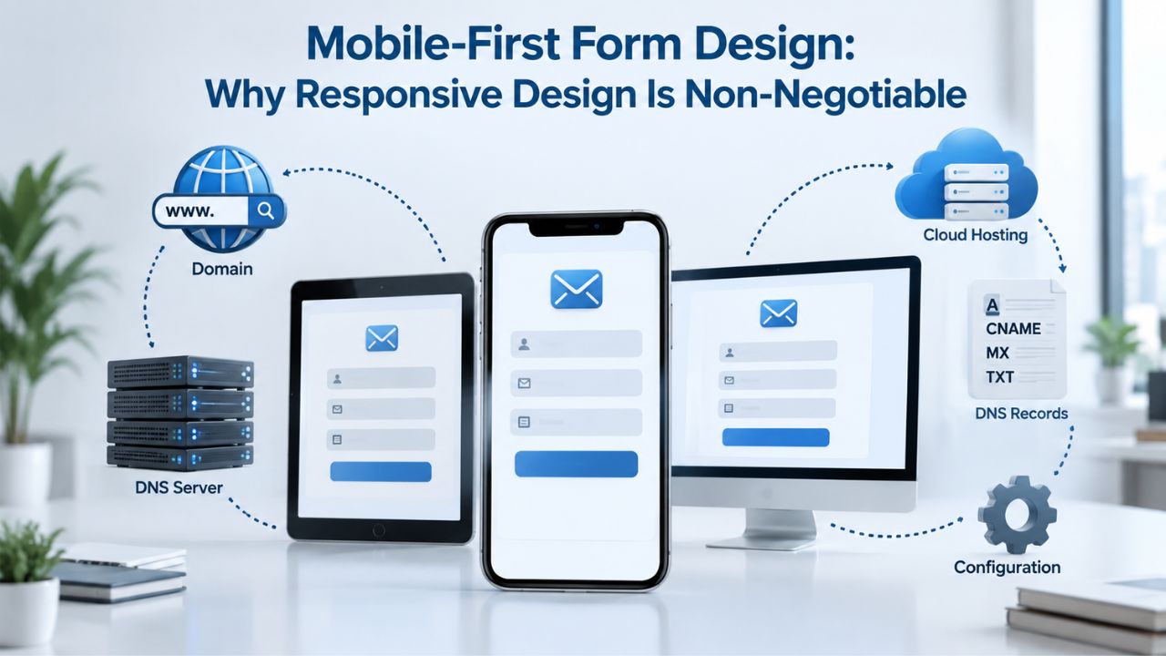
Mobile-First Form Design: Why Responsive Design Is Non-Negotiable
More than half of all emails are now opened on mobile devices, and signup forms live in an even more mobile-heavy environment where user expectations and tolerance for friction are completely different. If your form doesn’t render beautifully and function smoothly on a 6-inch smartphone screen, you’re losing a massive percentage of potential subscribers before they even see your offer. This section explains why mobile optimization isn’t optional; it’s essential.
The Mobile Conversion Penalty
In 2024, 48% of emails are opened on mobile devices, while only 11% of email templates are designed for smartphone users. The impact on signup forms is severe: 80% of mobile users are likely to delete an email or abandon a form if they cannot engage with it properly on their mobile device. The conversion penalty for signup forms is equally dramatic: desktop users convert at roughly 4.8% compared to mobile at 2.9%, representing a 40% drop in performance on the device that now drives over half of your traffic. This isn’t a minor issue; it’s a massive revenue leak happening every single day your form isn’t optimized.
The good news is that responsive design solves this problem directly. Emails and signup forms optimized for mobile devices tend to have higher open rates, click-through rates, and conversions overall, because they’re easier to read and interact with across different screen sizes. Your signup form needs the same attention: a single-column layout on mobile, touch-friendly button spacing, scalable fonts, and zero horizontal scrolling. When visitors encounter a form that works smoothly on their phone, completion rates and engagement skyrocket.
Building Mobile-Responsive Forms
A responsive signup form uses flexible layouts and media queries that automatically adjust based on screen size. On desktop, you might show two columns or a sidebar; on mobile, the form collapses to a single column to fit the narrow screen. Font sizes scale up for readability on small screens. Input fields expand to fill the available width, making them easier to tap with a finger. Load times stay fast; forms that take more than 3 seconds to load on mobile face 80%+ abandonment rates because users assume something is broken.
Yesmail’s benchmark report attributes much of mobile email-marketing success to more marketers using responsive design. The numbers confirm this: mobile revenue now accounts for 20% of all email-generated revenue, and mobile click-to-open rates are increasing 20% year over year, while desktop rates increased by only 6%. The bottom line is clear: if your form doesn’t look and feel native on mobile, you’re leaving significant conversions on the table. Every design decision- button size, label placement, input type, spacing- should be tested on actual phones and tablets, not just desktop browser previews.
Mobile vs. Desktop Signup Form Performance Benchmarks
| Performance Metric | Desktop Baseline | Mobile Reality | Year/Source | Strategic Implication |
|---|---|---|---|---|
| Email Open Rate | 25.5% average | Opens now driven by >60% mobile volume | 2024 Industry aggregate | Optimize forms for the device driving the majority of opens |
| Signup Form Conversion | ~4.8% | ~2.9% (40% drop) | 2024 (Discoveredlabs) | Mobile forms are a critical bottleneck; optimize ruthlessly |
| Click-to-Open Rate | +6% year-over-year | +20% year-over-year | 2024 | Mobile users engage more per open; easier to click on optimized forms |
| Responsive Design Impact | Forms work adequately | 80% abandonment without optimization | 2024 | Responsive design is non-negotiable, not optional |
| Load Time Threshold | <2 seconds acceptable | >3 seconds = 80%+ abandonment | Industry standard | Mobile load speed directly impacts conversion rate |
CTA Button Copy and Design: Moving Visitors to Action
Your call-to-action button is the moment of truth, the point where an interested visitor either commits to giving you their email address or clicks away to find something else. Everything about the button matters: the words you use, the color, the size, the placement, and how it feels to interact with it. A poorly designed CTA can cut your conversion rate in half; a well-crafted one can dramatically increase signups.
Action-Oriented Copy That Drives Clicks
CTA best practices prioritize clarity over cleverness, using action-oriented language that starts with verbs like “Get,” “Start,” “Discover,” and “Claim,” plus benefit-focused framing that highlights what users gain. Generic buttons like “Submit,” “Click Here,” or “Next” perform poorly because they tell the visitor nothing about what happens after they click. In contrast, specific, benefit-driven copy consistently outperforms vague alternatives: “Get My Free Guide,” “Start My Free Trial,” “Claim My Discount,” “Sign Up for Exclusive Access.” These phrases immediately answer the visitor’s implicit question: what will I receive if I give you my email?
One quantified example demonstrates the power of clarity: a client changed a CTA button from “JOIN THE TRIBE” to “SIGN UP NOW” and saw a 59% boost in conversions, proving that direct CTAs reduce anxiety and increase trust. The pattern repeats across industries and offer types: directness and clarity beat cleverness and cuteness every time. Your CTA button should answer one core question clearly: “What exactly happens when I click this?” If the answer isn’t immediately obvious from the button text alone, you need to rewrite it.
Design Elements That Command Attention
CTA buttons should use high-contrast colors that stand out dramatically from the form or email background, be large enough to stand out without overwhelming the overall design, and have white space around them to help them pop. Testing showed that using a button-based CTA increased click-through rate by 28% over a text link, proving that buttons are more eye-catching and effective than hyperlinks alone. The visual design matters as much as the copy.
Placement matters as much as design: ensure the CTA is the first or second item noticed when someone views your form, keep it above the fold on desktop so no scrolling is required to find it, and for longer content, repeat the CTA farther down in the copy to catch readers who’ve scrolled past the first button. Many high performers also add a postscript CTA, since people tend to read postscripts before the body copy. For signup forms, the button should be immediately visible when the form loads, without any scrolling. On mobile, ensure the button fills the available screen width or has a minimum width of at least 280 pixels so it’s genuinely easy to tap with a thumb or finger.
Lead Magnets and Value Exchange: Why Clear Incentives Drive Conversions
A signup form sitting alone on your page with no incentive, “Enter your email,” asks visitors for something without offering anything in return. A lead magnet fundamentally changes this equation: it’s a specific, valuable piece of content or incentive offered explicitly in exchange for an email address. When designed and positioned correctly, lead magnets turn casual browsers into genuinely interested leads ready to engage.
Which Lead Magnet Formats Convert Best
Quizzes are converting better than ever because they are personal and uniquely human in a world increasingly filled with generic AI content. With Interact, the average conversion rate for lead generation quizzes is 40.1%, meaning 4 out of 10 people who complete a quiz become a lead and join your email list. This dramatically outperforms static lead magnets: the average conversion rate for gated eBooks has dropped below 0.9%, while interactive tools including quizzes, assessments, calculators, and templates now convert at 5.2% or higher, representing a nearly 6x performance difference. The lesson is clear: interactivity and personalization beat passive, static content.
A quiz that asks relevant questions and delivers a tailored result feels like a conversation, not a transaction. A template that the visitor can immediately customize and use feels useful and actionable. Lead magnets in 2025 emphasize quality over quantity and real value over generic resources: attract the right leads with high-value resources that genuinely solve specific problems and demonstrate expertise. Your lead magnet should deliver immediate, tangible value, a quick win or clear insight, not a lengthy eBook that requires an hour to read and digest.
Lead Magnet Conversion Benchmarks by Channel
Email marketing consistently delivers the highest channel-to-lead conversion rates across all industries, with biotech leading at 12% and most industries ranging from 4–8%. In contrast, paid advertising channels like Meta Ads and Google Ads show 30–40% lower conversion rates, reflecting increased market saturation and audience fatigue. This doesn’t mean email is the only channel worth using; it means that if your lead magnet lives behind an email form on your owned website, that’s your highest-converting entry point for capturing subscribers. Paid ads drive traffic to your landing page; owned forms convert that traffic into owned audience members.
The second insight from industry data is equally important: lead magnets can increase overall conversions by 7 to 10x compared to pages with no gated offer or incentive. However, the type, format, specificity, and delivery speed of the lead magnet determine whether it generates qualified pipeline or merely attracts casual browsers who download and never engage. A well-designed lead magnet paired with a low-friction, mobile-optimized form is the foundation of sustainable, scalable email list growth.
Ready to Build Better Signup Forms?
A high-converting signup form starts with the fundamentals: fewer fields to reduce friction, a mobile-first design that respects user experience, clear, benefit-driven copy, and a compelling reason for visitors to opt in. If you’re running email marketing campaigns but struggling to grow your list, the signup form itself is often the bottleneck. Niya Digital’s Email Marketing Service includes a drag-and-drop signup form builder with responsive templates, built-in list-growth tracking, and compliance-first double opt-in automation to help you capture and qualify subscribers efficiently.
Double Opt-In vs. Single Opt-In: Compliance, Quality, and Sender Reputation
One of the most consequential decisions you’ll make about your signup process is whether to use single opt-in, which adds subscribers immediately upon form submission, or double opt-in, which requires email confirmation first. This choice affects list quality, compliance risk, sender reputation with email providers, and your long-term campaign success. Understanding the tradeoffs is essential.
How Double Opt-In Works and Why It Matters
Double opt-in is a subscription process that requires subscribers to confirm their subscription via an email confirmation link. In contrast, single opt-in only requires submitting a form and is completed immediately. Here’s the flow in practice: visitor submits the form → confirmation email lands in their inbox → they click a verification link → they’re officially added to the list. It’s one extra step, and that single step delivers powerful benefits. The quality difference is immediately dramatic: double opt-in adds an extra layer of verification for email addresses and strongly protects against abuse by preventing spam trap addresses and malicious bulk signups from landing on your list.
Beyond quality, double opt-in provides documented evidence of explicit consent for compliance regulations like GDPR and the CAN-SPAM Act, making it easier to prove subscriber intent if a regulator or legal authority ever asks for proof. This paper trail is invaluable if your list ever faces scrutiny. Double opt-in also forces subscribers to verify their email address works, reducing hard bounces and improving your sender reputation with ISPs like Gmail, Outlook, and Yahoo. These factors directly affect whether your emails land in the inbox or the spam folder.
When to Use Each Approach
Single opt-in makes sense for high-volume, low-friction offers: a flash-sale signup where people want immediate access to a discount code, a free-trial link that subscribers need instantly, or other time-sensitive offers. The tradeoff is clear: single opt-in grows your list faster, but at the cost of quality. Invalid email addresses, typos entered in haste, spam-trap addresses, and malicious bulk signups all land on your list and stay there until they bounce or generate complaints. These issues hurt your sender reputation over time; bounces and spam complaints accumulate, and ISPs track this data closely.
Double opt-in reduces your list growth rate by approximately 15–30% because some subscribers never confirm their email. However, this approach ensures a high-quality, verified list and dramatically improves compliance with regulations like GDPR and CAN-SPAM while maintaining better engagement and sender reputation. Best practice for most businesses: use double opt-in for newsletters, premium content, webinar signups, and any situation where you’re building a long-term relationship with subscribers. Use single opt-in only if immediate action is critical to your business model and your suppression and bounce-management processes are rock-solid and automated.
Form Placement and Testing Strategy: Getting Forms in Front of Eyes
Where your signup form lives on your website, how often it appears, and how you test and optimize it all directly impact signup volume and list quality. An invisible form converts zero subscribers. Forms that appear at the wrong moment or with the wrong message waste valuable traffic. This section covers strategic placement and the testing framework that drives continuous improvement.
Strategic Form Placement Across Your Website
High-converting businesses place signup forms in multiple locations, each serving a different moment in the visitor’s journey: sticky footer (always accessible as visitors scroll), exit-intent popup (catches visitors who are about to leave), mid-content embed (pauses the reader at a moment of high engagement), and header/navigation link (for visitors actively searching for the signup option). Each placement converts at different rates and captures different audience segments. A reader halfway through a blog post has significantly higher intent than a new visitor landing on your homepage for the first time, and conversion rates reflect that difference dramatically.
Mailchimp users saw a 50.8% increase in their list growth rate after strategically incorporating pop-up forms, and embedding sign-up forms directly on website pages has proven consistently successful alongside opt-in forms and lead magnet offers. But placement isn’t just about the number of forms; it’s about timing and respect for the user experience. An exit-intent popup that appears after 3 seconds feels aggressive and spammy; one that appears after 20 seconds of scrolling feels contextual and helpful. A sticky footer that takes up one-third of the screen is intrusive; one that takes up 12% is helpful and unobtrusive.
A/B Testing: The Path to Continuous Improvement
Start by establishing a baseline of current performance: measure your form conversion rate, total number of signups, and list-quality metrics like bounce rate, unsubscribe rate, and engagement on the first email sent to new subscribers. Then test one variable at a time: field count, CTA copy, button color, form placement, Lead magnet offer, or form design. Run the test for at least 2–4 weeks to gather statistical significance and eliminate false positives. Track not just signup volume, but also list quality: which form variation produces subscribers who actually open your first email and engage?
By systematically testing these variables and documenting results, you can identify the most effective combination and continuously improve your conversion rates. The best high-performing email marketing teams test relentlessly: they know that a 5–10% improvement on a form that sees 1,000 monthly visitors is worth 50 hours of testing, iteration, and refinement. They also know that testing one variable at a time, not multiple variables simultaneously, is the only way to know which change actually drove the improvement.
Building Trust with Clear Privacy Practices and Compliance Language
A signup form isn’t just a data-capture mechanism designed to extract email addresses; it’s also a trust-building moment where visitors decide whether you’re someone worth engaging with. Visitors hesitate to enter personal information because they’re genuinely uncertain and sometimes skeptical about how their data will be used, stored, and shared. Clear, honest language about privacy, compliance, and email practices reassures them and protects you from legal risk.

Privacy Statements That Reassure, Not Confuse
Your signup form should include a brief, plain-language statement about what you’ll actually do with the subscriber’s email address. Not a legal wall of dense text written by lawyers, but a 1–2 sentence plain-English promise written in conversational language: “We’ll send you weekly tips and updates. Unsubscribe anytime.” That clarity builds trust immediately. Always add a link to your full privacy policy so interested subscribers can review complete details, but don’t bury the summary in jargon or legal terminology that confuses people.
Both single- and double-opt-in methods help businesses comply with data privacy regulations like GDPR and CAN-SPAM, and many regions legally require explicit consent and clear opt-out instructions before sending marketing emails. This isn’t just legal protection; it’s ethical practice and the foundation of sustainable customer relationships. Visitors want to know you’re treating their inbox with respect and not selling their data. A form that says, “By clicking this button, you agree to receive marketing emails. You can opt out in each email,” sets expectations clearly upfront and shows you value their choice and autonomy.
Compliance Beyond the Form
Privacy and compliance start with the form and its language, but they extend through the entire subscriber journey from signup through all future emails. Double opt-in compliance best practices include maintaining clear consent records that document the date, method, and subscription declaration; enabling consent withdrawal and preference updates as soon as requested; and ensuring ongoing compliance with GDPR, PECR, and local regulations that vary by region. After signup, deliver religiously on your promise: send the promised content, make unsubscribe links obvious and easy to use, and honor preference updates immediately. This builds reputation and reduces spam complaints.
Welcome Email and Post-Signup Experience: Your First Impression After the Form
The moment a visitor clicks the submit button or confirms their email in double opt-in, your relationship with them truly begins. What happens in the first minutes and hours after signup sets the tone for everything that follows: Do they get genuine value or a bait-and-switch sales pitch? Do they feel like they made the right decision to join? This section covers the critical welcome sequence.
Timing and Content of the Welcome Email
The welcome email should arrive within minutes of signup, while intent and attention are highest. Almost 25% of email opens happen within the first hour of send time, meaning your welcome email has a narrow window to make a strong first impression. Use this moment to deliver on your core promise immediately: if you offered a free guide, attach it or link it with one obvious click. If you promised exclusive tips, start delivering them right away. Avoid the temptation to upsell or pitch a product; the welcome email exists to build trust and demonstrate value, not extract revenue.
A high-performing welcome email is short, friendly, and immediately useful in a way that matters to the subscriber. It sets clear expectations: “You’ll hear from us every Tuesday with actionable tips on [specific topic].” It makes unsubscribing easy and guilt-free (yes, truly easy, one click, no guilt-tripping copy). And it makes the subscriber feel like they made exactly the right decision to give you their email. Welcome emails sent within the first hour of signup generate 30–50% higher engagement rates than those sent the next day, making timing one of the most overlooked levers for driving engagement from day one.
Building Engaged Subscribers from Day One
The post-signup experience is where many marketers lose momentum and fail to capitalize on new subscriber intent. A form captures an email address, but only consistent, valuable communication over time turns that email into a genuinely engaged subscriber who opens emails, clicks links, and eventually converts. Automated emails generate 320% more revenue than non-automated ones, and personalized campaigns boost click-through rates by 14% on average, two facts that should inform your welcome sequence strategy. Use automation to send triggered welcome sequences based on signup source, segment new subscribers by behavior or stated preference, and nurture them with content that specifically matters to their situation.
The goal isn’t list size for its own sake; it’s list quality and engagement. A subscriber who opens most emails and clicks links regularly is worth exponentially more than a subscriber who ignores everything and eventually unsubscribes. Post-signup automation, segmentation, and personalization all drive that engagement from day one. They begin the moment someone hits submit on your signup form and continue through welcome sequences, preference centers, and personalized follow-ups.
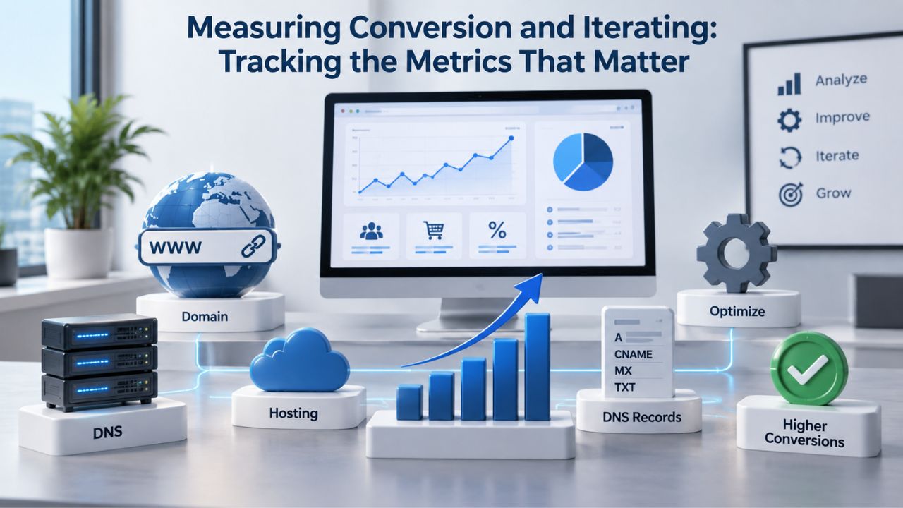
Measuring Conversion and Iterating: Tracking the Metrics That Matter
A signup form isn’t a set-and-forget asset you build once and then ignore. To optimize it and keep improving, you need clear, real-time visibility into performance, which elements work, and where visitors drop off. Measurement and continuous iteration are the only path to long-term improvement and sustained growth.
Key Metrics to Track and Why They Matter
Conversion Rate (signups ÷ form views × 100) is your north-star metric and the one you should obsess over first. A form that converts 3% of visitors is performing adequately; 5%+ is genuinely excellent; <1% is broken and needs immediate attention. Track this metric by traffic source: direct visitors, organic blog readers, and paid-traffic visitors often convert at very different rates, and these differences signal exactly where to focus optimization effort for the best return.
List Growth Rate (new signups ÷ average list size × 100) shows whether your growth is actually outpacing natural list decay. Healthy steady-state growth of 1–3% per month is acceptable and sustainable for mature lists, but that only keeps pace; to expand your reach, you need growth above that baseline. List Quality Metrics, including bounce rate (aim for <2%), unsubscribe rate (1–2% is typical), and engagement on the first email sent to new subscribers (open rate, click rate), tell you whether your form is attracting genuinely interested people. A form that captures 100 subscribers but produces 20% bounces is lower quality than one that captures 50 subscribers with 2% bounces, even though the first looks larger on paper.
Cost Per Lead (total campaign spend ÷ number of signups) is critical if you’re running paid traffic to your signup form. This metric helps you understand whether your form’s ROI actually makes sense for your business model and whether it justifies continued advertising investment. Track all of these metrics independently and together to get a complete picture.
The Testing and Iteration Cycle
Test one variable at a time: field count, CTA copy, button color, form placement, or lead magnet offer. Run it for at least 2–4 weeks to gather 100–200 signups minimum, which gives you statistical confidence that results aren’t random variation. Measure conversion rate, list quality, and subscriber engagement on the first email. If the new version wins on both conversion rate and quality, roll it out permanently and move to testing the next variable. If it wins on conversion but hurts quality, make a strategic call based on your business priority: growth or quality.
Document what you learn and test the next variable. Small, continuous improvements compound dramatically: a 5% improvement this quarter, another 5% next quarter, and you’ve effectively doubled your signup rate in a year. The businesses that grow email lists fastest aren’t the ones with the flashiest forms; they’re the ones that measure relentlessly, test systematically, and iterate continuously based on data, not intuition.
Start Optimizing Your Email Signup Form Today
Your signup form is the daily tool for growing your owned audience and building sustainable email marketing success. Whether you’re capturing 10 or 10,000 new subscribers per month, the fundamentals remain the same: fewer fields to reduce friction, mobile-optimized design that works beautifully on phones, clear, benefit-driven copy, and a trustworthy post-signup experience that delivers on promises. Niya Digital’s Email Marketing Service includes built-in compliance automation, subscriber segmentation, and welcome-sequence templates to help you turn signups into genuinely engaged subscribers.
Frequently Asked Questions
What is the ideal number of fields for a signup form?
The ideal number is 2–3 fields for maximum conversion: email address (required for all), first name (optional but recommended for personalization), and one additional field only if it serves a specific business need like company name or job title for B2B segmentation. Research consistently shows that forms with three fields can increase conversions by up to 160% compared to those with ten or more fields. Keep signup minimal; gather additional data through follow-up emails and preference centers after the relationship starts and engagement is established.
Should I use single opt-in or double opt-in?
Double opt-in is the safest choice for most businesses because it verifies email addresses, improves compliance with privacy regulations like GDPR and CAN-SPAM, and protects your sender reputation. Double opt-in requires users to click a confirmation link, which slows growth but ensures a high-quality, verified list that generates better engagement. Single opt-in works only if you’re comfortable with higher bounce rates and spam-complaint risk, and your business model demands immediate list growth above quality.
How important is mobile optimization for signup forms?
Mobile optimization is critical, non-negotiable for success. More than 60% of email opens happen on mobile devices, and 80% of mobile users are likely to delete an email if they cannot engage with it on a mobile device. Your signup form needs a single-column layout on mobile, touch-friendly buttons at least 44×44 pixels, scalable fonts, and load times under 3 seconds. Test your form on actual phones and tablets, not just desktop previews.
What lead magnet converts best?
Interactive lead magnets convert best: quizzes, assessments, calculators, and templates consistently outperform static content like eBooks. Quizzes convert at an average rate of 40.1%, meaning 4 out of 10 quiz takers become a lead, significantly outperforming gated eBooks, which convert below 0.9%. The key is to deliver immediate, personalized value and solve a specific problem, not offer a lengthy download that takes hours to complete and process.
How often should I test my signup form?
Test continuously but strategically. Pick one variable (field count, CTA copy, lead magnet, or placement) and run the test for at least 2–4 weeks with 100+ signups to gather statistical confidence. Implement the winning version permanently, then test the next variable. Small, compounding improvements, 5% per quarter, drive significant year-over-year gains in signup rate and list quality.
What should I include in a welcome email?
A welcome email should arrive within the first hour of signup, deliver on your core promise (send the free guide, unlock the discount, confirm the webinar link), set expectations for future emails, and make unsubscribing simple and guilt-free. Almost 25% of opens happen within the first hour of send time, so timing your welcome email to arrive immediately can significantly boost engagement. Avoid pitches; focus on building trust and delivering value.
How do I measure signup form success?
Track three metrics: conversion rate (signups ÷ form views), list quality (bounce rate and unsubscribe rate), and engagement (open rate of welcome email). A form that converts 5% but produces 25% bounces is lower-quality than one converting 2% with 1% bounces. Average email list growth across all industries is approximately 2.5% per month; healthy steady-state growth of 1–3% per month is considered acceptable. Aim to exceed that baseline.
What privacy language should I include on a signup form?
Use a 1–2 sentence plain-English statement: “We’ll send you weekly tips on [topic]. Unsubscribe anytime.” Add a link to your full privacy policy, but don’t bury the summary in legal jargon. Both single- and double-opt-in methods help businesses comply with data privacy regulations like GDPR and CAN-SPAM, and many regions require explicit consent and clear opt-out instructions. Transparency builds trust and protects you legally.
How quickly do email lists decay, and what can I do about it?
Email lists decay by 20–30% annually through unsubscribes, address abandonment, and natural churn. Combat this by growing your list faster than it decays, regularly cleaning out invalid addresses, re-engaging inactive subscribers, and monitoring bounce and complaint rates monthly. A healthy list requires active maintenance and continuous growth, not just one-time setup.
Can I use popups to capture email signups?
Yes, popups work when designed with user experience in mind. Mailchimp users saw a 50.8% increase in list growth after strategically incorporating pop-up forms. But timing and design matter critically: an exit-intent popup that appears after 20 seconds of scrolling feels contextual and helpful; one that appears after 3 seconds feels aggressive. Keep popup size reasonable, make the close button obvious, and respect the visitor’s experience.
What is a lead magnet, and how does it affect conversion?
A lead magnet is a specific, valuable piece of content or incentive, a checklist, template, quiz, guide, discount, or free trial, offered in exchange for an email address. Lead magnets can increase overall conversions by 7 to 10x compared to pages with no gated offer, though the type, format, specificity, and delivery speed determine whether they generate qualified leads or attract casual browsers. A strong lead magnet removes the question “Why should I give you my email?” and replaces it with “Yes, I want this.”
How do I reduce form abandonment on mobile?
Reduce form fields to 2–3 essentials, use a single-column layout, make buttons at least 44×44 pixels for easy tapping, use dropdown menus instead of open text fields when possible (reduces cognitive load), ensure fast load times under 3 seconds, and test on actual phones. Desktop users convert at roughly 4.8% compared to mobile at 2.9%, so mobile optimization is critical for reaching increasingly mobile-first audiences; every mobile friction point compounds abandonment.
What’s the best CTA button copy for email signups?
Use action-oriented, benefit-driven copy: “Get My Free Guide,” “Start My Free Trial,” “Claim My Discount,” “Sign Up for Weekly Tips.” Avoid generic or vague copy like “Submit,” “Click Here,” or “Next.” A client changed a CTA from “JOIN THE TRIBE” to “SIGN UP NOW” and saw a 59% boost in conversions, proving that direct, clear CTAs reduce anxiety. Your button should answer: “What exactly happens if I click?”
How does email authentication affect signup form design?
Authentication protocols don’t directly affect signup form design, but they affect inbox placement for emails you send after signup. In 2024, the average email deliverability rate hovered around 83.1%, meaning nearly one in six marketing emails never reached the inbox. A well-designed signup form builds a high-quality list, which improves engagement metrics that ISPs use to determine sender reputation. Better reputation plus proper authentication equals better inbox placement.
What’s the difference between a popup form and an embedded form?
A popup form appears as an overlay on top of the page content, with higher visibility but more intrusive. An embedded form sits within the page itself, less intrusive but with lower visibility. Use embedded forms for high-intent areas like blog posts and product pages where readers are actively engaged. Use popups for exit-intent captures or time-delayed offers when engagement is lower. Both formats work best when combined strategically throughout your site.
Glossary
- Click-Through Rate (CTR): The percentage of email recipients who clicked at least one link in an email, calculated as (number of clicks ÷ number of emails delivered) × 100. A strong CTR for marketing emails averages 2–3%, while 5%+ indicates highly engaged subscribers or especially relevant content.
- Double Opt-In: An email subscription process requiring two steps: form submission and email confirmation via a link. The subscriber must click the confirmation link to be added to the list, verifying their email address and explicit consent while protecting sender reputation and list quality.
- Lead Magnet: A valuable piece of gated content or incentive, such as a checklist, template, quiz, eBook, discount code, or free trial, offered in exchange for a visitor’s email address, designed to convert casual browsers into owned, addressable leads.
- List Decay: The natural annual loss of valid email addresses from an email list due to unsubscribes, hard bounces, job changes, address abandonment, and typos. Industry-standard decay rate is 22–30% annually, requiring continuous new-subscriber growth to maintain or expand list size.
- Open Rate: The percentage of delivered emails opened by recipients, calculated as (number of opens ÷ number of emails delivered) × 100. Industry-average open rates range from 20–30%, though rates vary significantly by industry, send time, and subject line quality.
- Sending Reputation: The ISP trust score assigned to an email sender based on engagement metrics (open rate, click rate), bounce rates, complaint rates, authentication protocols (SPF, DKIM, DMARC), and sending volume. A high sender reputation improves inbox placement; a low reputation increases spam-folder risk.
- Single Opt-In: An email subscription method that requires only form submission; the subscriber is added to the email list immediately with no confirmation email. Faster list growth but higher risk of invalid addresses, typos, and malicious signups that damage sender reputation.